Product Bar
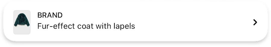
Product information display, including typography for product details and optional price styling.
ProductBarTheme {
  prices: ProductBarPricesTheme | null // (1)!

  typography {
    product: TextStyle // (2)!
    brand: TextStyle // (3)!
  }

  icons {
    arrow16: Icon // (4)!
  }

  settings {
    applyProductFirstImageExtraPadding: Bool // (5)!
  }
}
- Configures the price display settings for the product bar, including typography and colors for price elements.
- Defines the text style for product names in the product bar.
- Specifies the text style for brand names displayed in the product bar.
- Sets the icon used to indicate expandable product details in the compact view.
- Controls whether additional padding is applied to the first product image in the list.
Product imageUrls and applyProductFirstImageExtraPadding
The flat lay image without paddings should be the first in the list of imageUrls in the Product if applyProductFirstImageExtraPadding is set to true
Prices
ProductBarPricesTheme {
  typography {
    price: TextStyle // (1)!
  }

  colors {
    discountedPrice: Color // (2)!
  }
}
- Configures the text style specifically for price displays in the product bar.
- Defines the color used to highlight discounted prices in the product bar.
Data required
This feature only needs to be configured if you pass price in the Product
{"Bool": "/sdk/developer/definitions/#bool", "Color": "/sdk/developer/definitions/#color", "Icon": "/sdk/developer/definitions/#icon", "ProductBarPricesTheme": "#prices", "TextStyle": "/sdk/developer/definitions/#textstyle", "null": "/sdk/developer/definitions/#optional"}