Page Bar
Navigation bar appearance, including title styling and navigation button icons.
PageBarTheme {
typography {
pageTitle: TextStyle // (1)!
}
icons {
back24: Icon // (2)!
close24: Icon // (3)!
}
settings {
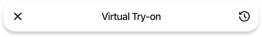
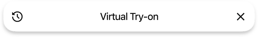
preferCloseButtonOnTheRight: Bool // (4)!
}
}
- Defines the text style for page titles in the navigation bar, controlling the appearance of header text.
- Specifies the icon used for the back navigation button.
- Sets the icon for the close button.
- Controls the position of the close button, determining whether it appears on the right side of the navigation bar.
Close button position
{"Bool": "/sdk/developer/definitions/#bool", "Icon": "/sdk/developer/definitions/#icon", "TextStyle": "/sdk/developer/definitions/#textstyle"}