Theme
Specifies the theme configuration settings that determine the appearance and style of the UI components within the SDK. This includes defining color schemes, typography, and other visual elements to ensure a cohesive and customizable user interface experience.
Theme {
color: ColorTheme // (1)!
label: LabelTheme // (2)!
image: ImageTheme // (3)!
button: ButtonTheme // (4)!
pageBar: PageBarTheme // (5)!
bottomSheet: BottomSheetTheme // (6)!
activityIndicator: ActivityIndicatorTheme // (11)!
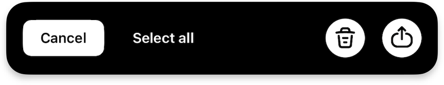
selectionSnackbar: SelectionSnackbarTheme // (7)!
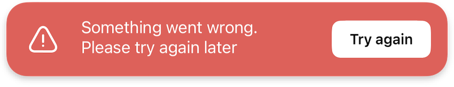
errorSnackbar: ErrorSnackbarTheme // (8)!
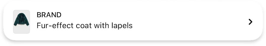
productBar: ProductBarTheme // (9)!
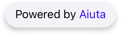
powerBar: PowerBarTheme // (10)!
}
-
Defines the color scheme, brand colors, and various color states for UI elements.

-
Typography and text styling for different label types across the interface.
-
Shapes, sizes, and error state icon for image views.

-
Buttons styles, including typography and shape configurations for different button sizes.

-
Navigation bar appearance, including title styling and navigation button icons.
-
Bottom sheet presentation, including grabber appearance and sheet shape for both main SDK and internal sheets.
-
Multi-selection interface for list views, including selection controls and action buttons.
-
Error message presentation, including error icons and retry button styling.
-
Product information display, including typography for product details and optional price styling.
-
"Powered By Aiuta" branding element appearance.
-
Appearance and customization of loading indicators.