Feedback
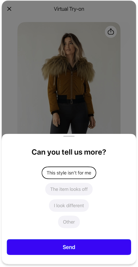
Optional configuration for collecting user feedback on TryOn results.
TryOnFeedbackFeature {
  otherFeedback: TryOnFeedbackOtherFeature | null // (1)!

  icons {
    like36: Icon // (2)!
    dislike36: Icon // (3)!
    gratitude40: Icon // (4)!
  }

  strings {
    feedbackOptions: List<String> // (5)!
    feedbackTitle: String // (6)!
    feedbackButtonSkip: String // (7)!
    feedbackButtonSend: String // (8)!
    feedbackGratitudeText: String // (9)!
  }
}
- Optional configuration for allowing users to provide custom feedback on try-on results.
- Icon displayed for the "Like" feedback option.
- Icon displayed for the "Dislike" feedback option.
- Icon shown after feedback is submitted to express gratitude.
- List of available feedback options presented to users.
- Title text displayed in the feedback section.
- Label text for the button that allows users to skip providing feedback.
- Label text for the button that submits the user's feedback.
- Message displayed to users after they submit their feedback.
Other Feedback
TryOnFeedbackOtherFeature {
  strings {
    otherFeedbackTitle: String // (1)!
    otherFeedbackButtonSend: String // (2)!
    otherFeedbackButtonCancel: String // (3)!
    otherFeedbackOptionOther: String // (4)!
  }
}
- Title text displayed in the custom feedback section.
- Label text for the button that submits the custom feedback.
- Label text for the button that cancels the custom feedback.
- Text label for the option to provide custom feedback.
{"Icon": "/sdk/developer/definitions/#icon", "List": "/sdk/developer/definitions/#list", "String": "/sdk/developer/definitions/#string", "TryOnFeedbackOtherFeature": "#other-feedback", "null": "/sdk/developer/definitions/#optional"}