Skip to content

Try On Scheme

Configures the core virtual try-on functionality for trying products virtually.

Loading Screen Results Screen

Try On Feature

TryOnFeature {
  tryOn {
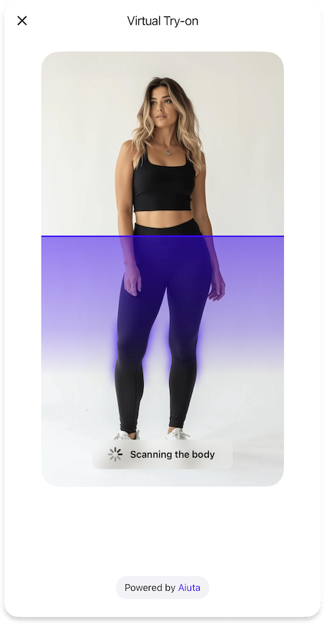
    loadingPage: TryOnLoadingPageFeature // (1)!
    inputImageValidation: TryOnInputImageValidationFeature // (2)!
    cart: TryOnCartFeature // (3)!
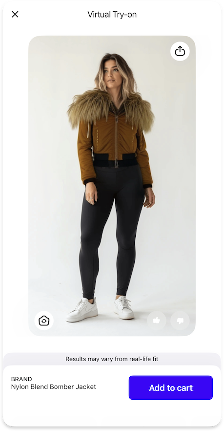
    fitDisclaimer: TryOnFitDisclaimerFeature | null // (4)!
    feedback: TryOnFeedbackFeature | null // (5)!
    generationsHistory: TryOnGenerationsHistoryFeature | null // (6)!
    otherPhoto: TryOnWithOtherPhotoFeature | null // (7)!

    settings {
      isBackgroundExecutionAllowed: Bool // (8)!
      tryGeneratePersonSegmentation: Bool // (9)!
    }

    icons {
      tryOn20: Icon // (10)!
    }

    strings {
      tryOnPageTitle: String // (11)!
      tryOn: String // (12)!
    }

    styles {
      tryOnButtonGradient: List<Color> | null // (13)!
    }
  }
}
  1. Configuration for the loading page displayed during the TryOn process.
  2. Configuration for validating input images before processing.
  3. Configuration for cart-related functionality in the TryOn interface.
  4. Optional configuration for displaying fit disclaimers to users.
  5. Optional configuration for collecting user feedback on TryOn results.
  6. Optional configuration for managing the history of generated TryOn results.
  7. Optional configuration for allowing users to continue with a different photo.
  8. Determines whether the SDK should wait for the generation results in the background when closed.
  9. Enables local person segmentation highlighting during loading on iOS 15+.
  10. Icon displayed for the TryOn magic button in the interface.
  11. Title text displayed at the top of the TryOn page.
  12. Label text used for the "Try On" buttons throughout the interface.
  13. Optional gradient colors for styling the TryOn button.

Sequence diagram

The sequence diagram of executing a virtual try-on operation.

sequenceDiagram
    autonumber
    actor USR as ⠀<br>User
    participant APP as Your<br>App
    participant BE as Your<br>Backend
    participant SDK as Aiuta<br>SDK
    participant API as Aiuta<br>Backend
    participant GS as Storage
    note over GS: Aiuta or Yours

    USR->>SDK: Pick a Photo / Tap Try-on button in the SDK UI
    activate SDK

    SDK->>API: Create operation<br>(image ID, product ID)
    activate API
    Note over SDK,API: Secure authenticated request
    API-->>SDK: Operation ID

    par
        API->>API: Generate image
        API->>GS: Save generated image
        deactivate API
        Note over API,GS: Anonymous.<br>The photo is associated with the<br>app entry, not the user entry
    and
        loop internal configuration delay
            SDK->>API: Request operation status
            API-->>SDK: Operation details
            Note over API,SDK: status, generated_images | error
            SDK-->>SDK: Check operation status
            Note over SDK: Repeat while<br>CREATED | IN_PROGRESS | PAUSED

        end
    end

    critical Check operation status
        option SUCCESS
            SDK->>SDK: Add images to the history
            SDK->>GS: Get result image by the URL
            activate GS
            GS-->>SDK: Image data
            deactivate GS
            SDK-->>USR: Present results
            Note over SDK,USR: User may interact with results

        option ABORTED
            rect
                SDK-->>USR: Report couldn't detect anyone
            end
            Note over SDK,USR: User may select other photo and start over

        option FAILED | CANCELLED
            rect
                SDK-->>USR: Show something went wrong error
                deactivate SDK
            end
            Note over SDK,USR: User may try again to start over
    end

Sub Features


Loading Page

TryOnLoadingPageFeature {
  strings {
    tryOnLoadingStatusUploadingImage: String // (1)!
    tryOnLoadingStatusScanningBody: String // (2)!
    tryOnLoadingStatusGeneratingOutfit: String // (3)!
  }

  styles {
    loadingStatusBackgroundGradient: List<Color> | null // (4)!
    loadingStatusStyle: primary | blurred | blurredWithOutline // (5)!
  }
}
  1. Text displayed while uploading the user's image to the server.
  2. Text displayed while scanning and analyzing the body in the image.
  3. Text displayed while generating the virtual try-on outfit.
  4. Optional gradient colors for the loading status background.
  5. Visual style for the loading status indicator, either primary (solid) or blurred (with optional outline).

Input Image Validation

TryOnInputImageValidationFeature {
  strings {
    invalidInputImageDescription: String // (1)!
    invalidInputImageChangePhotoButton: String // (2)!
  }
}
  1. Message displayed to users when their uploaded image fails validation.
  2. Label text for the button that allows users to select a different photo.

Cart

TryOnCartFeature {
  strings {
    addToCart: String // (1)!
  }

  handler {
    addToCartAction: Callback(String) // (2)!
  }
}
  1. Label text for the button that adds the current product to the cart.
  2. Callback function that handles adding a product to the cart using its identifier.

Fit Disclaimer

TryOnFitDisclaimerFeature {
  icons {
    info20: Icon | null // (1)!
  }

  strings {
    fitDisclaimerTitle: String // (2)!
    fitDisclaimerDescription: String // (3)!
    fitDisclaimerButtonClose: String // (4)!
  }

  typography {
    disclaimer: TextStyle // (5)!
  }
}
  1. Optional icon displayed in the fit disclaimer to provide visual context.
  2. Title text displayed in the fit disclaimer message.
  3. Detailed description text explaining the fit disclaimer information.
  4. Label text for the button that dismisses the fit disclaimer.
  5. Defines the text style for the fit diclaimer label text.

Feedback

TryOnFeedbackFeature {
  otherFeedback: TryOnFeedbackOtherFeature | null // (1)!

  icons {
    like36: Icon // (2)!
    dislike36: Icon // (3)!
    gratitude40: Icon // (4)!
  }

  strings {
    feedbackOptions: List<String> // (5)!
    feedbackTitle: String // (6)!
    feedbackButtonSkip: String // (7)!
    feedbackButtonSend: String // (8)!
    feedbackGratitudeText: String // (9)!
  }
}
  1. Optional configuration for allowing users to provide custom feedback on try-on results.
  2. Icon displayed for the "Like" feedback option.
  3. Icon displayed for the "Dislike" feedback option.
  4. Icon shown after feedback is submitted to express gratitude.
  5. List of available feedback options presented to users.
  6. Title text displayed in the feedback section.
  7. Label text for the button that allows users to skip providing feedback.
  8. Label text for the button that submits the user's feedback.
  9. Message displayed to users after they submit their feedback.

Other Feedback

TryOnFeedbackOtherFeature {
  strings {
    otherFeedbackTitle: String // (1)!
    otherFeedbackButtonSend: String // (2)!
    otherFeedbackButtonCancel: String // (3)!
    otherFeedbackOptionOther: String // (4)!
  }
}
  1. Title text displayed in the custom feedback section.
  2. Label text for the button that submits the custom feedback.
  3. Label text for the button that cancels the custom feedback.
  4. Text label for the option to provide custom feedback.

Other Photo

TryOnWithOtherPhotoFeature {
  icons {
    changePhoto24: Icon // (1)!
  }
}
  1. Icon displayed for the "Change Photo" action, allowing users to continue with a different photo.

Generations History

TryOnGenerationsHistoryFeature {
  icons {
    history24: Icon // (1)!
  }

  strings {
    generationsHistoryPageTitle: String // (2)!
  }

  dataProvider: BuiltIn | Custom {
    generatedImages: Observable<List<GeneratedImage>> // (3)!
    addGeneratedImages: Callback(List<GeneratedImage>) // (4)!
    deleteGeneratedImages: Callback(List<GeneratedImage>) // (5)!
  }
}
  1. Icon displayed for the History button in the page bar.
  2. Title text displayed at the top of the generations history page.
  3. Observable collection of previously generated try-on images.
  4. Callback function to add new generated images to the history.
  5. Callback function to remove images from the generations history.

Generated Image

GeneratedImage {
    id: String // (1)!
    url: String // (2)!
    ownerType: OwnerType // (3)!
    productIds: List<String> // (4)!
}
  1. A unique string identifier assigned to the image by the Aiuta API, ensuring each image can be distinctly recognized and referenced within the system.
  2. The URL pointing to the location of the image resource, which can be accessed and retrieved by the SDK to present in the UI.
  3. The type of the image owner .
  4. A list of product identifiers that were utilized during the image generation process. Each identifier corresponds to a specific product involved in the try-on session, allowing for precise tracking and reference within the system.

Generated images represent the results of try-on sessions. These images are generated based on either a photo uploaded by the user or a predefined model image provided by Aiuta.

Owner Type
enum OwnerType {
    user // (1)!
    aiuta // (2)!
}
  1. Image uploaded or generated by the user (using a camera or from a gallery).

    This image belongs to the user. When the user removes the image from the history, it may be deleted from the storage as well.

  2. Image of the model provided or generated by the Aiuta.

    This image could be linked to the user history, but it is not owned by the user, and can not be deleted from the storage, only unlinked from the user's history in case of removing.

Owner type primarily determines the source of origin of the image — whether it was generated by the user as a result of any chain of operations from upload to generation, possibly including re-generation. Alternatively, the image is not associated with the user's personal data and does not belong to them. This allows different approaches to be taken when deleting images from the history.

Sequence Diagrams

The sequence diagram of removing images from the user's history using custom data providers.

sequenceDiagram
    autonumber
    actor USR as ⠀<br>User
    participant APP as Your<br>App
    participant BE as Your<br>Backend
    participant SDK as Aiuta<br>SDK
    participant API as Aiuta<br>Backend
    participant GS as Storage
    note over GS: Aiuta or Yours

    USR->>SDK: Select image(s) to delete
    activate SDK

    SDK-->>USR: Show activity indicator
    SDK->>APP: Call deleteUploadedImages / deleteGeneratedImages
    activate APP
    APP->>BE: Delete images
    activate BE

    opt user owned images 
        alt Aiuta storage
            BE->>API: Delete images by ID
            activate API
            API-xGS: Delete files
            API-->>BE: Deletion response
            deactivate API
        else your storage
            BE-xGS: Delete files
        end
    end
    BE->>BE: Remove images from the user's records

    BE-->>APP: Acknowledge deletion
    deactivate BE

    APP-->>SDK: Acknowledge deletion
    SDK-->>USR: Hide activity indicator
    APP-->>SDK: Update observable history lists
    deactivate APP

    SDK->>SDK: Update history display
    SDK-->>USR: Show updated history
    deactivate SDK

Important: Owner Type Handling

When deleting images from the history, the behavior depends on the ownerType

  • user images can be deleted from storage and removed from history
  • aiuta images should only be unlinked from user history, not deleted from storage

This ensures that shared model images remain available for other users while user-generated content can be properly cleaned up

The sequence diagram of adding newly uploaded and generated images to the user's history using custom data providers.

sequenceDiagram
    autonumber
    actor USR as ⠀<br>User
    participant APP as Your<br>App
    participant BE as Your<br>Backend
    participant SDK as Aiuta<br>SDK
    participant API as Aiuta<br>Backend
    participant GS as Storage
    note over GS: Aiuta or Yours

    APP->>SDK: Provide configuration with observable data providers
    activate SDK
    SDK-->>SDK: Subscribe to observable<br>history lists changes
    deactivate SDK

    Note over SDK,API: After successful try-on generation
    activate SDK
    SDK->>APP: Call addUploadedImages / addGeneratedImages
    APP->>BE: Link new images<br>to the user's history
    APP-->>SDK: Update observable data providers
    SDK->>SDK: Update local history display
    deactivate SDK

    USR->>SDK: Tap History Button / Change photo
    activate SDK
    SDK-->>USR: Display History Data
    Note over SDK,USR: Shows list of generated / uploaded<br>images with most recent first

    opt cache not exitst/expired
        SDK->>GS: Get images by the URL
        GS-->>SDK: Images data
        SDK->>SDK: Cache images
        deactivate SDK
    end