Onboarding
Sets up the onboarding process to guide users through the SDK's features and capabilities.
OnboardingFeature {
howItWorksPage: OnboardingHowItWorksPageFeature // (1)!
bestResultsPage: OnboardingBestResultsPageFeature | null // (2)!
strings {
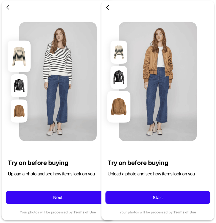
onboardingButtonNext: String // (3)!
onboardingButtonStart: String // (4)!
}
shapes {
onboardingImageL: Shape // (5)!
onboardingImageS: Shape // (6)!
}
dataProvider: BuiltIn | Custom {
isOnboardingCompleted: Observable<Bool> // (7)!
completeOnboarding: Callback() // (8)!
}
}
- Configures the first page of onboarding that demonstrates how virtual try-on works through interactive examples.
- Sets up an optional page showing examples of photos that yield the best try-on results.
- Defines the text label for the navigation button to proceed to the next onboarding page.
- Specifies the text label for the button that completes onboarding and starts the main interface.
- Controls the shape configuration for large images displayed in the onboarding process.
- Sets the shape configuration for small images used in the onboarding interface.
- Provides an observable property that tracks whether the user has completed the onboarding process.
- Defines the callback function to mark onboarding as completed when the user finishes the process.
{"Bool": "/sdk/developer/definitions/#bool", "BuiltIn": "/sdk/developer/definitions/#dataprovider", "Callback": "/sdk/developer/definitions/#callback", "Custom": "/sdk/developer/definitions/#dataprovider", "Observable": "/sdk/developer/definitions/#observable", "OnboardingBestResultsPageFeature": "best-results/", "OnboardingHowItWorksPageFeature": "how-it-works/", "Shape": "/sdk/developer/definitions/#shape", "String": "/sdk/developer/definitions/#string", "null": "/sdk/developer/definitions/#optional"}