Image Picker Scheme
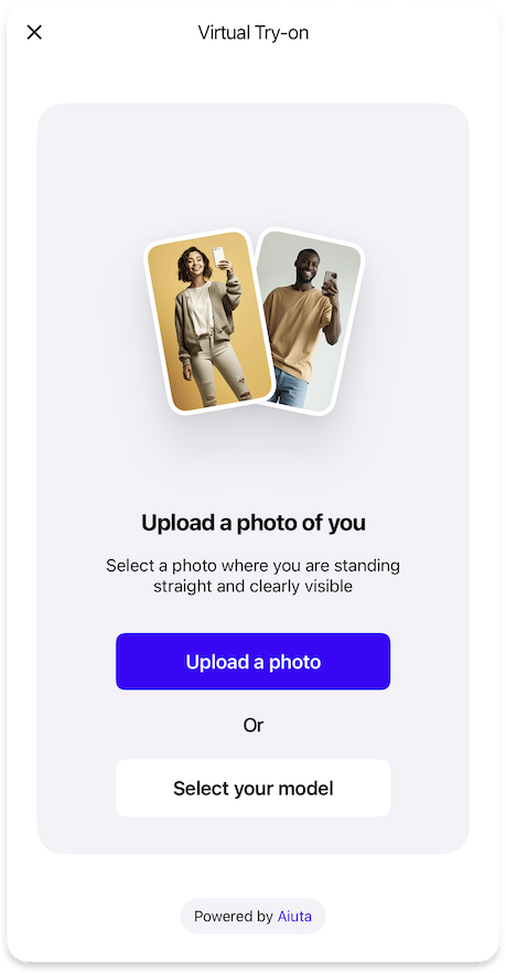
Controls the image selection interface, allowing users to pick photos, take new ones, use predefined models, or access previous uploads.
Image Picker Feature
ImagePickerFeature {
camera: ImagePickerCameraFeature | null // (1)!
photoGallery: ImagePickerPhotoGalleryFeature // (2)!
predefinedModels: ImagePickerPredefinedModelFeature | null // (3)!
uploadsHistory: ImagePickerUploadsHistoryFeature | null // (4)!
images {
examples: List<Image> // (5)!
}
strings {
imagePickerTitleEmpty: String // (6)!
imagePickerDescriptionEmpty: String // (7)!
imagePickerButtonUploadImage: String // (8)!
}
}
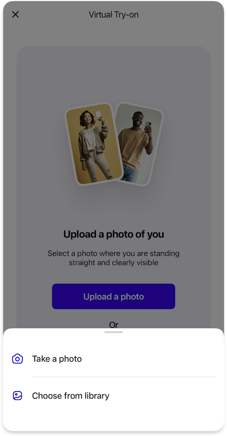
- Configuration for camera functionality, allowing users to take new photos directly within the SDK.
- Configuration for accessing and selecting images from the device's photo library.
- Configuration for using predefined model images as an alternative to user photos.
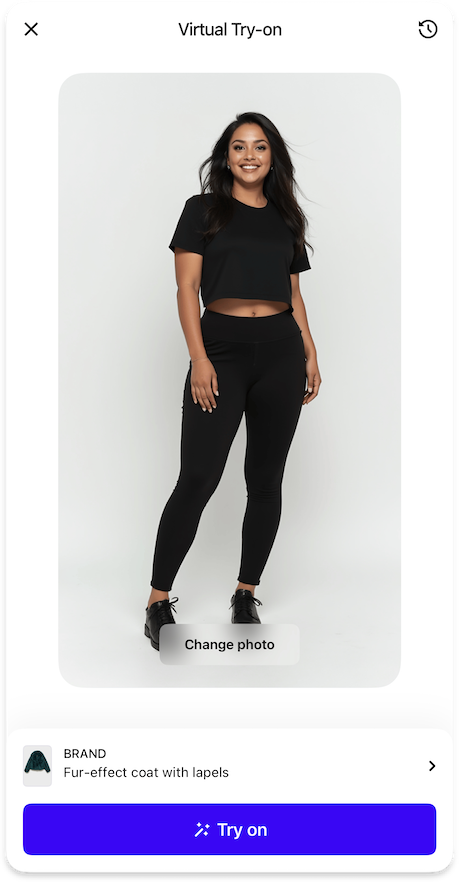
- Configuration for managing and reusing previously uploaded images.
- List of exactly 2 example of input images to display in the image picker interface.
- Title text displayed above images when the image picker is empty.
- Description text shown when the image picker is empty.
- Label text for the button used to upload new photos.
Sequence Diagrams
Detailed sequence of the user selecting the source image for the virtual try-on.
sequenceDiagram
autonumber
actor USR as ⠀<br>User
participant APP as Your<br>App
participant BE as Your<br>Backend
participant SDK as Aiuta<br>SDK
participant API as Aiuta<br>Backend
participant GS as Storage
note over GS: Aiuta or Yours
USR->>APP: Tap Try-on Button
APP->>SDK: Start Try-on (Product)
activate SDK
SDK-->>USR: Present SDK UI
USR->>SDK: Select / take a new photo
SDK->>API: Upload a photo
activate API
API->>GS: Save input image
Note over API,GS: Anonymous.<br>The photo is associated with the<br>app entry, not the user entry
API->>API: Generate image ID, form URL
API-->>SDK: Return image ID, URL
deactivate API
SDK->>SDK: Start Try-on (Image)
deactivate SDK
sequenceDiagram
autonumber
actor USR as ⠀<br>User
participant APP as Your<br>App
participant BE as Your<br>Backend
participant SDK as Aiuta<br>SDK
participant API as Aiuta<br>Backend
participant GS as Storage
note over GS: Aiuta or Yours
USR->>APP: Tap Try-on Button
APP->>SDK: Start Try-on (Product)
activate SDK
SDK-->>USR: Present SDK UI
USR->>SDK: Select model / previously used photo
SDK->>SDK: Add/Reorder image in the history
Note right of SDK: Using the image ID
SDK->>SDK: Start Try-on (Image)
deactivate SDK
Detailed sequence of the user selecting the source image for the virtual try-on with custom configuration.
sequenceDiagram
autonumber
actor USR as ⠀<br>User
participant APP as Your<br>App
participant BE as Your<br>Backend
participant SDK as Aiuta<br>SDK
participant API as Aiuta<br>Backend
participant GS as Storage
note over GS: Aiuta or Yours
USR->>APP: Tap Try-on Button
APP->>SDK: Start Try-on (Product)
activate SDK
SDK-->>USR: Present SDK UI
USR->>SDK: Tap upload a photo
SDK->>SDK: Check consent obtained
opt consent required
SDK-->>USR: Present consent page
USR->>SDK: Accept consent terms
SDK->>APP: Call obtainConsentIds (consent IDs)
APP->>BE: Store consents obtained
end
SDK-->>USR: Show options for uploading
USR->>SDK: Select/take a new photo
SDK->>API: Upload a photo
activate API
API->>GS: Save input image
Note over API,GS: Anonymous.<br>The photo is associated with the<br>app entry, not the user entry
API->>API: Generate image ID, form URL
API-->>SDK: Return image ID, URL
deactivate API
SDK->>SDK: Start Try-on (Image)
deactivate SDK
sequenceDiagram
autonumber
actor USR as ⠀<br>User
participant APP as Your<br>App
participant BE as Your<br>Backend
participant SDK as Aiuta<br>SDK
participant API as Aiuta<br>Backend
participant GS as Storage
note over GS: Aiuta or Yours
USR->>APP: Tap Try-on Button
APP->>SDK: Start Try-on (Product)
activate SDK
SDK-->>USR: Present SDK UI
USR->>SDK: Select model / previously used photo
SDK->>APP: Add/Select image in the history
APP->>BE: Update uploads history
Note over APP,BE: Recent image first in the list
APP-->>SDK: Update data provider observable list
SDK->>SDK: Start Try-on (Image)
deactivate SDK
Sub Features
Camera
ImagePickerCameraFeature {
icons {
camera24: Icon // (1)!
}
strings {
cameraButtonTakePhoto: String // (2)!
cameraPermissionTitle: String // (3)!
cameraPermissionDescription: String // (4)!
cameraPermissionButtonOpenSettings: String // (5)!
}
}
- Icon displayed for the camera button in the bottom sheet list.
- Label text for the button used to take a photo.
- Title text displayed in the alert when camera permissions are denied.
- Description text shown in the alert when camera permissions are denied.
- Label text for the button that opens app settings to change camera permissions.
Photo Gallery
ImagePickerPhotoGalleryFeature {
icons {
gallery24: Icon // (1)!
}
strings {
galleryButtonSelectPhoto: String // (2)!
}
}
- Icon displayed for the gallery button in the bottom sheet list.
- Label text for the button used to select a photo from the gallery.
Predefined Models
ImagePickerPredefinedModelFeature {
icons {
selectModels24: Icon // (1)!
}
data {
preferredCategoryId: String // (2)!
}
strings {
predefinedModelPageTitle: String // (3)!
predefinedModelOr: String // (4)!
predefinedModelErrorEmptyModelsList: String // (5)!
predefinedModelCategories: Map<String, String> // (6)!
}
}
- Icon displayed for the predefined models button in the bottom sheet list.
- Identifier of the preferred category to show by default when user opens models page.
- Title text for the predefined models page and button in the bottom sheet list.
- Label text displayed before the predefined models button in the image picker.
- Error message shown when the list of predefined models is empty.
- Mapping of category identifiers to their display titles, typically covering
man
andwoman
categories.
Uploads History
ImagePickerUploadsHistoryFeature {
strings {
uploadsHistoryButtonNewPhoto: String // (1)!
uploadsHistoryTitle: String // (2)!
uploadsHistoryButtonChangePhoto: String // (3)!
}
styles {
changePhotoButtonStyle: primary | blurred // (4)!
}
dataProvider: BuiltIn | Custom {
uploadedImages: Observable<List<InputImage>> // (5)!
addUploadedImages: Callback(List<InputImage>) // (6)!
deleteUploadedImages: Callback(List<InputImage>) // (7)!
selectUploadedImage: Callback(InputImage) // (8)!
}
}
- Text label for the button to upload a new photo.
- Title text displayed at the top of the uploads history bottom sheet.
- Text label for the button to change the currently selected photo.
- Visual style for the change photo button, either primary (solid) or blurred (with optional outline).
- Observable collection of images previously uploaded by the user, with most recent first.
- Callback to add new images to the uploads history.
- Callback to remove images from the uploads history.
- Callback to move a selected image to the top of the history when reused.
Input Image
InputImage {
id: String // (1)!
url: String // (2)!
ownerType: OwnerType // (3)!
}
- A unique string identifier assigned to the image by the Aiuta API, ensuring each image can be distinctly recognized and referenced within the system.
- The URL pointing to the location of the image resource, which can be accessed and retrieved by the SDK to present in the UI.
- The type of the image owner .
Input images used in the Aiuta SDK for try-on sessions can either be uploaded by users, such as photos taken with their camera or selected from their gallery, or they can be predefined model images provided by Aiuta.
Owner Type
enum OwnerType {
user // (1)!
aiuta // (2)!
}
-
Image uploaded or generated by the user (using a camera or from a gallery).
This image belongs to the user. When the user removes the image from the history, it may be deleted from the storage as well.
-
Image of the model provided or generated by the Aiuta.
This image could be linked to the user history, but it is not owned by the user, and can not be deleted from the storage, only unlinked from the user's history in case of removing.
Owner type primarily determines the source of origin of the image — whether it was generated by the user as a result of any chain of operations from upload to generation, possibly including re-generation. Alternatively, the image is not associated with the user's personal data and does not belong to them. This allows different approaches to be taken when deleting images from the history.
Sequence Diagrams
The sequence diagram of removing images from the user's history using custom data providers.
sequenceDiagram
autonumber
actor USR as ⠀<br>User
participant APP as Your<br>App
participant BE as Your<br>Backend
participant SDK as Aiuta<br>SDK
participant API as Aiuta<br>Backend
participant GS as Storage
note over GS: Aiuta or Yours
USR->>SDK: Select image(s) to delete
activate SDK
SDK-->>USR: Show activity indicator
SDK->>APP: Call deleteUploadedImages / deleteGeneratedImages
activate APP
APP->>BE: Delete images
activate BE
opt user owned images
alt Aiuta storage
BE->>API: Delete images by ID
activate API
API-xGS: Delete files
API-->>BE: Deletion response
deactivate API
else your storage
BE-xGS: Delete files
end
end
BE->>BE: Remove images from the user's records
BE-->>APP: Acknowledge deletion
deactivate BE
APP-->>SDK: Acknowledge deletion
SDK-->>USR: Hide activity indicator
APP-->>SDK: Update observable history lists
deactivate APP
SDK->>SDK: Update history display
SDK-->>USR: Show updated history
deactivate SDK
Important: Owner Type Handling
When deleting images from the history, the behavior depends on the ownerType
user
images can be deleted from storage and removed from historyaiuta
images should only be unlinked from user history, not deleted from storage
This ensures that shared model images remain available for other users while user-generated content can be properly cleaned up
The sequence diagram of adding newly uploaded and generated images to the user's history using custom data providers.
sequenceDiagram
autonumber
actor USR as ⠀<br>User
participant APP as Your<br>App
participant BE as Your<br>Backend
participant SDK as Aiuta<br>SDK
participant API as Aiuta<br>Backend
participant GS as Storage
note over GS: Aiuta or Yours
APP->>SDK: Provide configuration with observable data providers
activate SDK
SDK-->>SDK: Subscribe to observable<br>history lists changes
deactivate SDK
Note over SDK,API: After successful try-on generation
activate SDK
SDK->>APP: Call addUploadedImages / addGeneratedImages
APP->>BE: Link new images<br>to the user's history
APP-->>SDK: Update observable data providers
SDK->>SDK: Update local history display
deactivate SDK
USR->>SDK: Tap History Button / Change photo
activate SDK
SDK-->>USR: Display History Data
Note over SDK,USR: Shows list of generated / uploaded<br>images with most recent first
opt cache not exitst/expired
SDK->>GS: Get images by the URL
GS-->>SDK: Images data
SDK->>SDK: Cache images
deactivate SDK
end