Consent
Manages user consent options for data processing, which can be integrated with onboarding or used independently.
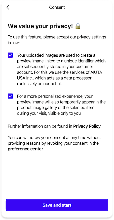
A dedicated consent page shown as part of the onboarding flow. Appears as the last onboarding slide, after the welcome screen (if enabled), or as the first screen if no onboarding is configured.
ConsentStandaloneOnboardingPageFeature {
  strings {
    consentPageTitle: String | null // (1)!
    consentTitle: String // (2)!
    consentDescriptionHtml: String // (3)!
    consentFooterHtml: String | null // (4)!
    consentButtonAccept: String // (5)!
  }

  icons {
    consentTitle24: Icon // (6)!
  }

  styles {
    drawBordersAroundConsents: Bool // (7)!
  }

  data {
    consents: List<Consent> // (8)!
  }

  dataProvider: BuiltIn | Custom {
    obtainedConsentIds: Observable<List<String>> // (9)!
    obtainConsentIds: Callback(List<String>) // (10)!
  }
}
- Optional title for the standalone consent page at the top of the screen.
- Main title displayed on the standalone consent page.
- HTML content describing the consent terms and conditions.
- Optional HTML footer content for additional information.
- Text label for the button that accepts the consent terms.
- Icon displayed next to the consent title in the standalone page.
-
Controls whether to display borders around consent sections.
-
List of consent options that users must and may accept.
- Observable property tracking which consent options have been already accepted.
-
Callback function triggered when user accepts consents.
You should save the consent IDs that are passed and provide them in the
obtainedConsentsIdsproperty for future use. If not stored, the SDK will show the consent screen again during the next Try-On session.
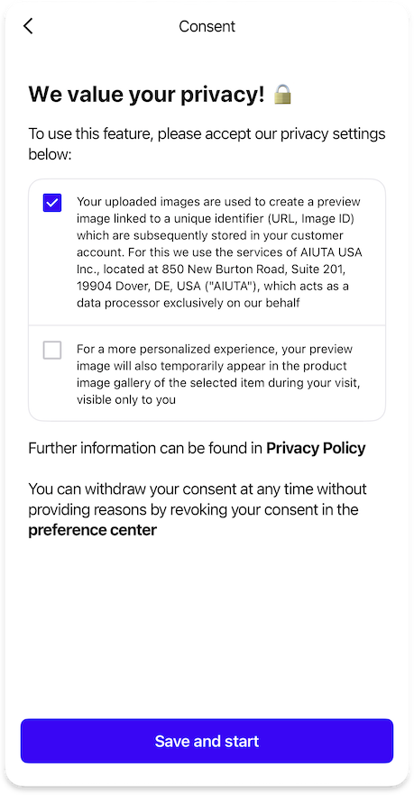
A dedicated consent page shown when the user is about to upload their photo in the image picker. Recommended when using the predefined models feature, as users can try on without personal photos and consent is only needed when they choose to upload their own.
ConsentStandaloneImagePickerPageFeature {
  strings {
    consentPageTitle: String | null // (1)!
    consentTitle: String // (2)!
    consentDescriptionHtml: String // (3)!
    consentFooterHtml: String | null // (4)!
    consentButtonAccept: String // (5)!
  }

  icons {
    consentTitle24: Icon // (6)!
  }

  styles {
    drawBordersAroundConsents: Bool // (7)!
  }

  data {
    consents: List<Consent> // (8)!
  }

  dataProvider: BuiltIn | Custom {
    obtainedConsentIds: Observable<List<String>> // (9)!
    obtainConsentIds: Callback(List<String>) // (10)!
  }
}
- Optional title for the standalone consent page at the top of the screen.
- Main title displayed on the standalone consent page.
- HTML content describing the consent terms and conditions.
- Optional HTML footer content for additional information.
- Text label for the button that accepts the consent terms.
- Icon displayed next to the consent title in the standalone page.
-
Controls whether to display borders around consent sections.
-
List of consent options that users must and may accept.
- Observable property tracking which consent options have been already accepted.
-
Callback function triggered when user accepts consents.
You should save the consent IDs that are passed and provide them in the
obtainedConsentsIdsproperty for future use. If not stored, the SDK will show the consent screen again during the next Try-On session.
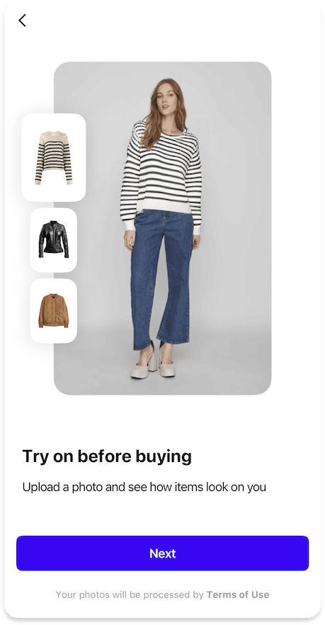
Legal information displayed at the bottom of the onboarding screen. Users are not required to explicitly accept the terms to proceed — this is simply informational text with links to privacy policy and/or terms of service. This is the default consent mode.
ConsentEmbeddedIntoOnboardingFeature {
  strings {
    consentHtml: String // (1)!
  }
}
- HTML content displayed at the bottom of the onboarding screen for embedded consent.