Other styles, toggles and settings
This page contains descriptions of additional unclassified settings for various user interface components that provide more configuration flexibility.
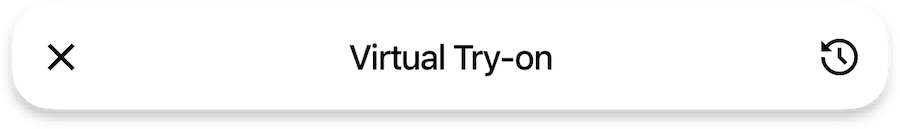
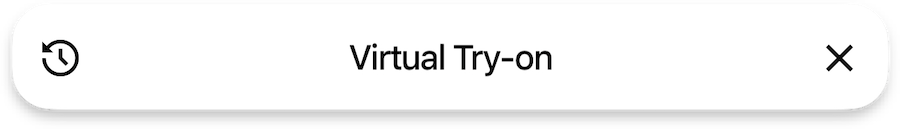
Page Bar
A toggle to specify whether the close button should be positioned on the right side.
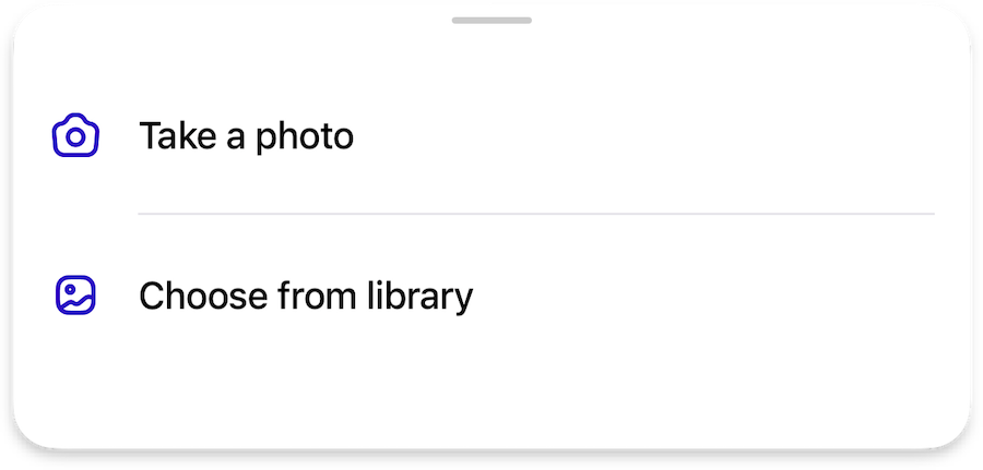
Bottom Sheet
Adjusting delimiters in the bottom sheet icon buttons


Component Style
Adjusting colors on some buttons and status views, where explicitly available
Shapes are independent and are not affected by this styles

brandbackground coloronDarkforeground color for labels and icons

onLightbackground coloronDarkforeground color for labels and icons

onDarkbackground coloronLightforeground color for labels and icons

- apply a blurred background that matches the color
scheme(lightordark) primaryforeground color for labels and icons
- apply a blurred background that matches the color
scheme(lightordark) primaryforeground color for labels and iconsoutlinecolor for the border
Refer to the colors