Welcome Screen
The Welcome Screen is an optional feature that can be displayed when users first open the SDK. It serves as an introduction to your virtual try-on experience and can be customized to match your brand identity.
When to Use
- Show the welcome screen on the first launch of the SDK
- Use it to introduce users to the virtual try-on experience
- Set the tone for the user journey
Behavior
The Welcome Screen is displayed only if the user has not completed the Onboarding. Thus, it is bound to the Onboarding feature. If the Onboarding is not provided, the Welcome Screen will be displayed every time the SDK is opened and you should care of enabling or disabling the Welcome Screen feature in the configuration to control the Welcome Screen visibility yourself.
Customization
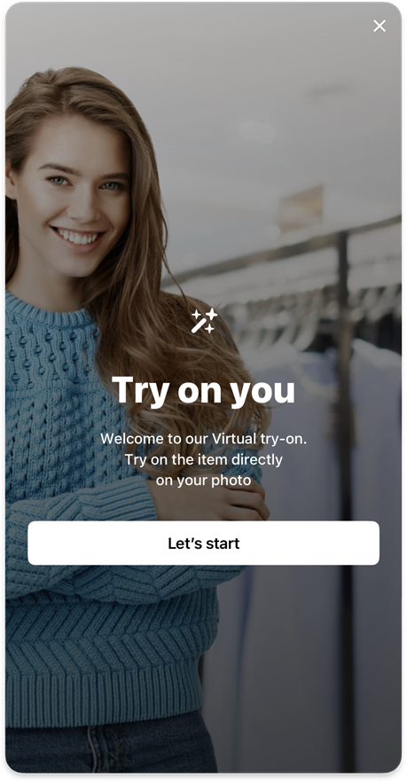
Customization
Images
- Custom
welcomeBackgroundimage that fills the entire screen
Make sure image itself is dimmed to be contrast enough with onDark color
Icons
- Custom central
welcome82icon displayed above the title (82x82 points) - General
close24icon for close button
Text Elements
- Main
welcomeTitleheading that introduces the feature - Supporting
welcomeDescriptionexplaining the virtual try-on experience - Call-to-action
welcomeButtonStartto begin the experience
Typography
- Custom
welcomeTitletext style for the title - Custom
welcomeDescriptiontext style for the description text - General
buttonMtext style for the start button
Shapes
- General
buttonMshape of start button
Colors
- General
onDarkcolor for close button, title, description and start button background - General
onLightcolor for start button label
Analytics
The following analytics events are tracked on the Welcome Screen:
| Type | Event | Page Id | Description |
|---|---|---|---|
page | welcome | Triggered when the welcome screen is displayed | |
onboarding | welcomeStartClicked | welcome | Triggered when user clicks the start button to start the journey |
exit | welcome | SDK was closed on the welcome screen |
How to implement
- Android
- iOS
- Flutter