Configuration Scheme
The configuration is structured as a hierarchical object that controls various aspects of the SDK's behavior, appearance, and functionality. The configuration is designed to be flexible and extensible, allowing for customization of features, UI elements, and behavior.
Naming Convention
Implementation and naming details may vary depending on the specific platform, but the core concepts and overall structure remain consistent across all platforms. For example type names, described in the schemes, like:
-
Configuration- in Swift it will be
Aiuta.Configuration - in Kotlin and Dart -
AiutaConfiguration
- in Swift it will be
-
UserInterface- in Swift it will be
Aiuta.Configuration.UserInterface - in Kotlin and Dart -
AiutaUserInterfaceConfiguration
- in Swift it will be
-
Product- in Swift it will be
Aiuta.Product - in Kotlin and Dart -
AiutaProduct
- in Swift it will be
and so on - the key part of the name is the same.
A scheme-based approach in the documentation applies core concepts and structures uniformly, unifying the SDK's understanding and implementation. By following this strategy, we achieve consistency in our SDK's implementations and minimize redundancy in our documentation for each platform. We use this documentation ourselves for development.
Annotations
Don't miss them - click for more details
Type Definitions
Configuration
Configuration {
  auth: Auth // (1)!
  userInterface: UserInterface // (2)!
  features: Features // (3)!
  analytics: Analytics | null // (4)!
  debugSettings: DebugSettings // (5)!
}
-
Required to authenticate Aiuta SDK to use API with your credentials. Supported authentication methods are
ApiKeyorJwt+subscriptionId.Please see API documentation Obtaining credentials section for instructions on how to get your credentials.
-
Configuration of the user interface presentation style, swipe-to-dismiss policy, and UI components themes for the Aiuta SDK.
-
Describes the set of features enabled in the SDK for the user and thier interaction with the app.
-
Allows to receive analytics events from the SDK and send them to your analytics provider.
-
Controls the logging settings and validation policies for various parameters.
Auth
ApiKeyAuth {
  apiKey: String // (1)!
}
-
The
apiKeyis used to authenticate all outgoing requests from the Aiuta SDK to the Aiuta API. This key ensures that the requests are linked to your account, allowing the SDK to access the necessary resources and services provided by Aiuta.Please see API documentation obtaining credentials section for instructions on how to get your
apiKey
JwtAuth {
  subscriptionId: String // (1)!
  getJwt: Callback(Map<String: String>) => String // (2)!
}
-
The
subscriptionIdis used to authenticate requests that do not require secure transmission. It acts as a key to ensure that the requests are properly linked to your subscription and account.Please see API documentation obtaining credentials section for instructions on how to find your
subscriptionId -
This method is invoked by the SDK each time a tryOn request necessitates authentication through a JSON Web Token. The implementation of this method should securely generate the JWT on the server side and subsequently return it to the SDK.
The SDK will provide a set of key-value pairs that represent the
parametersof the request requiring a JWT. These parameters include identifiers like auploaded_image_idandproduct_idand can be used for associating the JWT with the specific image and product involved in the tryOn request. This ensures that the generated token is tailored specifically to the request being processed, enhancing security and relevance.Returns
Non-empty string representing the generated JWT
Throws
An error if the JWT cannot be generated.
If an error is thrown, the SDK will be unable to complete the tryOn request and will display an error message to the user
See JWT server-side auth example for more details on securely generating JWTs.
User Interface
UserInterface {
  presentationStyle: PresentationStyle // (1)!
  swipeToDismiss: SwipeToDismissPolicy // (2)!
  theme: Theme // (3)!
}

enum PresentationStyle {
  fullScreen // (4)!
  bottomSheet // (5)!
  pageSheet // (6)!
}

enum SwipeToDismissPolicy {
  allowAlways // (7)!
  allowHeaderSwipeOnly // (8)!
  protectTheNecessaryPages // (9)!
}
-
iOS and Flutter only
Specifies the manner in which the SDK's UI overlays the application's existing UI. This setting determines the visual presentation style, such as whether the SDK UI appears as a full-screen overlay, or covers the application with a bottom sheet.
-
iOS only
This property specifies the policy for dismissing the SDK's user interface through a swipe gesture. It determines how and when the swipe-to-dismiss action can be performed by the user. The policy can vary, allowing for different levels of interaction, such as always allowing a swipe to dismiss, restricting it to certain conditions, or permitting it only when swiping from specific areas of the interface.
-
Specifies the theme configuration settings that determine the appearance and style of the UI components within the SDK. This includes defining color schemes, typography, and other visual elements to ensure a cohesive and customizable user interface experience.
-
Presents the SDK in full-screen mode. This style occupies the entire screen, hiding the parent view completely.
-
Opens the SDK in a bottom sheet.
Partial iOS support
This mode is supported on iOS from version
16onwards. For older versions, it defaults topageSheet. UnlikepageSheet, the parent view remains fullscreen but is covered by the sheet, rather than being stacked behind it. -
The SDK appears in a page sheet, which partially covers the parent view, allowing users to see some of the underlying content while interacting with the SDK. Unlike a
bottomSheet, which keeps parent view fullscreen, a page sheet stacking the parent view behind, slightly shrinking and moving it away from the screen edges.- This mode is recommended starting from iOS 13. For more information, refer to Best practices from Apple's HIG .
- On Android, this mode behaves as a
bottomSheet.
-
Allows the SDK to be dismissed at any time by swiping down anywhere on the screen.
This policy provides the most flexibility for users, enabling them to close the SDK from any page or context.
-
Restricts dismissal to swiping down on the header area only.
This policy limits the swipe-to-dismiss gesture to the header area, reducing the likelihood of accidental dismissals.
-
Applies different swipe-to-dismiss policies based on the page context.
- On pages that are safe to close, such as onboarding or photo picker pages, the
allowAlwayspolicy is applied, allowing dismissal from anywhere on the screen. - On critical pages, such as those waiting for generation or displaying results, the
allowHeaderSwipeOnlypolicy is applied to prevent accidental dismissals.
This policy provides a balance between user convenience and protecting critical workflows, ensuring that users can dismiss the SDK when appropriate while safeguarding important pages.
- On pages that are safe to close, such as onboarding or photo picker pages, the
Theme
Theme {
  color: ColorTheme // (1)!
  label: LabelTheme // (2)!
  image: ImageTheme // (3)!
  button: ButtonTheme // (4)!
  pageBar: PageBarTheme // (5)!
  bottomSheet: BottomSheetTheme // (6)!
  activityIndicator: ActivityIndicatorTheme // (11)!
  selectionSnackbar: SelectionSnackbarTheme // (7)!
  errorSnackbar: ErrorSnackbarTheme // (8)!
  productBar: ProductBarTheme // (9)!
  powerBar: PowerBarTheme // (10)!
}
-
Defines the color scheme, brand colors, and various color states for UI elements.

-
Typography and text styling for different label types across the interface.
-
Shapes, sizes, and error state icon for image views.

-
Buttons styles, including typography and shape configurations for different button sizes.


-
Navigation bar appearance, including title styling and navigation button icons.
-
Bottom sheet presentation, including grabber appearance and sheet shape for both main SDK and internal sheets.
-
Multi-selection interface for list views, including selection controls and action buttons.
-
Error message presentation, including error icons and retry button styling.
-
Product information display, including typography for product details and optional price styling.
-
"Powered By Aiuta" branding element appearance.
-
Appearance and customization of loading indicators.

Color
ColorTheme {
  scheme: ColorScheme // (1)!
  brand: Color // (2)!
  primary: Color // (3)!
  secondary: Color // (4)!
  onDark: Color // (5)!
  onLight: Color // (6)!
  background: Color // (7)!
  screen: Color // (8)!
  neutral: Color // (9)!
  border: Color // (10)!
  outline: Color // (11)!
}

enum ColorScheme {
  light // (12)!
  dark // (13)!
}
-
Defines whether the SDK uses a light or dark theme. Provided colors should match the scheme.
Affects the style of blur components
On
iOS onlyit affects the appearance of system screens (e.g., photo gallery, share activity, etc.) and ensures that theirUIUserInterfaceStylematches the selected style. For example, if the SDK is set to a light theme but the system theme on the device is dark, the system windows invoked by the SDK will still use the light theme. -
Main accent color for primary actions and highlights throughout the interface.
Default ARGB
#FF4000FF -
Primary color used for main content labels and icons, and important information.
Default ARGB
#FF000000 -
Secondary color used for supporting content and less prominent information.
Default ARGB
#FF9F9F9F -
Preferably light color in any scheme optimized for use on dark, brand, and neutral backgrounds.

Default ARGB
#FFFFFFFF -
Preferably dark color in any scheme optimized for use on light backgrounds.
Default ARGB
#FF000000 -
Main background color used throughout the SDK interface.
Default ARGB
#FFFFFFFF -
Zero-elevation background color.
For the full-screen mode in the
darkscheme, this color is used as a page background color, while bottom sheets inside the SDK will still use thebackgroundcolor. In any scheme, it will be used for full-screen image galleries.It's actually supposed to be black or close to black in any scheme.
Default ARGB
#FF000000 -
Neutral background color used for various UI components.
Default ARGB
#FFF2F2F7 -
Color used for component borders and dividers.
Default ARGB
#FFE5E5EA -
Color used for blur outlines and checkmark borders.
Default ARGB
#FFC7C7CC -
Light theme with predominantly light colors in the design.
-
Dark theme with predominantly dark colors in the design.
Label
LabelTheme {
  typography {
    titleL: TextStyle // (1)!
    titleM: TextStyle // (2)!
    regular: TextStyle // (3)!
    subtle: TextStyle // (4)!
  }
}
- Defines the text style for large titles, typically used for main headings and prominent text elements.
- Specifies the text style for medium titles, commonly used for section headers and secondary headings.
- Sets the text style for regular body text and standard content throughout the interface.
- Determines the text style for subtle or less prominent text, often used for secondary information and supporting content.
Image
ImageTheme {
  shapes {
    imageL: Shape // (1)!
    imageS: Shape // (2)!
  }

  icons {
    imageError36: Icon // (3)!
  }
}
- Defines the shape configuration for large image views, allowing customization of the visual appearance for prominent images.
- Specifies the shape configuration for small image views, enabling consistent styling for secondary or thumbnail images.
- Sets the icon to be displayed when an image fails to load, providing visual feedback for error states.
Button
ButtonTheme {
  typography {
    buttonM: TextStyle // (1)!
    buttonS: TextStyle // (2)!
  }

  shapes {
    buttonM: Shape // (3)!
    buttonS: Shape // (4)!
  }
}
- Defines the text style for a regular medium-sized buttons.
- Specifies the text style for small buttons.
- Sets the shape configuration for medium buttons.
- Configures the shape for small buttons.
Page Bar
PageBarTheme {
  typography {
    pageTitle: TextStyle // (1)!
  }

  icons {
    back24: Icon // (2)!
    close24: Icon // (3)!
  }

  settings {
    preferCloseButtonOnTheRight: Bool // (4)!
  }
}
- Defines the text style for page titles in the navigation bar, controlling the appearance of header text.
- Specifies the icon used for the back navigation button.
- Sets the icon for the close button.
-
Controls the position of the close button, determining whether it appears on the right side of the navigation bar.
Bottom Sheet
BottomSheetTheme {
  typography {
    iconButton: TextStyle // (1)!
    chipsButton: TextStyle // (2)!
  }

  shapes {
    bottomSheet: Shape // (3)!
    chipsButton: Shape // (4)!
  }

  grabber {
    width: Number // (5)!
    height: Number // (6)!
    topPadding: Number // (7)!
  }

  settings {
    extendDelimitersToTheRight: Bool // (8)!
    extendDelimitersToTheLeft: Bool // (9)!
  }
}
- Defines the text style for icon buttons within the bottom sheet.
- Specifies the text style for chips-style buttons in the bottom sheet interface.
- Sets the shape configuration for the bottom sheet container, controlling its visual appearance.
- Configures the shape for chips-style buttons, determining their visual style.
- Controls the width of the grabber handle used for dragging the bottom sheet.
- Determines the height of the grabber handle for bottom sheet interaction.
- Sets the vertical padding between the grabber and the top of the bottom sheet.
- Controls whether the bottom sheet delimiters extend to the right edge.
- Determines whether the bottom sheet delimiters extend to the left edge.
Activity Indicator
ActivityIndicatorTheme {
  icons {
    loading14: Icon | null // (1)!
  }

  colors {
    overlay: Color // (4)!
  }
  settings {
    indicationDelay: Number // (2)!
    spinDuration: Number // (3)!
  }
}
-
Optional icon for the activity indicator. If not provided, the system's default indicator will be used.
System activity indicator by default -
The time in milliseconds before the activity indicator appears. If the task completes before this delay, the indicator will not be shown. Otherwise, the indicator will appear.
-
The duration in milliseconds for one complete rotation of the activity indicator. This setting controls how fast the indicator spins, providing a visual cue of activity progress.
The spin duration only applies when a custom icon is used for the activity indicator. If the system's default indicator is used, this setting will be ignored and the indicator will spin with the system default speed.
-
Overlay color used to cover any view when it needs to be locked for an activity. The activity indicator will be placed at the center of this overlay.
Selection
SelectionSnackbarTheme {
  strings {
    select: String // (1)!
    cancel: String // (2)!
    selectAll: String // (3)!
    unselectAll: String // (4)!
  }

  icons {
    trash24: Icon // (5)!
    check20: Icon // (6)!
  }

  colors {
    selectionBackground: Color // (7)!
  }
}
- Defines the text label for the select action button in the selection interface.
- Specifies the text label for the cancel action button to dismiss the selection mode.
- Sets the text label for the select all action to choose all available items.
- Configures the text label for the unselect all action to deselect all chosen items.
- Specifies the icon used for the delete action in the selection interface.
- Sets the icon displayed to indicate selected items in the interface.
- Controls the background color of the selection snackbar component.
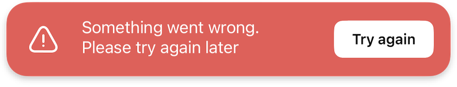
Error
ErrorSnackbarTheme {
  strings {
    defaultErrorMessage: String // (1)!
    tryAgainButton: String // (2)!
  }

  icons {
    error36: Icon // (3)!
  }

  colors {
    errorBackground: Color // (4)!
    errorPrimary: Color // (5)!
  }
}
- Defines the default text message displayed when an error occurs in the interface.
- Specifies the text label for the retry action button in the error snackbar.
- Sets the icon displayed to indicate the error state in the snackbar.
- Controls the background color of the error snackbar component.
- Defines the primary color used for error-related elements in the snackbar.
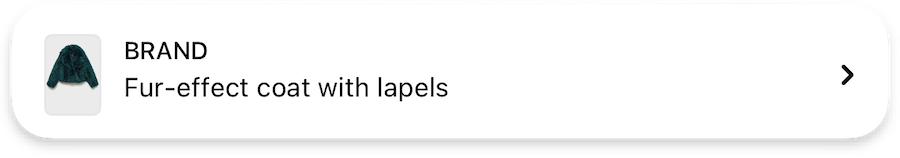
Product
ProductBarTheme {
  prices: ProductBarPricesTheme | null // (1)!
  typography {
    product: TextStyle // (2)!
    brand: TextStyle // (3)!
  }

  icons {
    arrow16: Icon // (4)!
  }

  settings {
    applyProductFirstImageExtraPadding: Bool // (5)!
  }
}

ProductBarPricesTheme {
  typography {
    price: TextStyle // (6)!
  }

  colors {
    discountedPrice: Color // (7)!
  }
}
- Configures the price display settings for the product bar, including typography and colors for price elements.
- Defines the text style for product names in the product bar.
- Specifies the text style for brand names displayed in the product bar.
- Sets the icon used to indicate expandable product details in the compact view.
- Controls whether additional padding is applied to the first product image in the list.
- Configures the text style specifically for price displays in the product bar.
- Defines the color used to highlight discounted prices in the product bar.
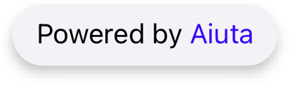
Powered By
PowerBarTheme {
  strings {
    poweredByAiuta: String // (1)!
  }

  colors {
    aiuta: PowerBarColorScheme // (2)!
  }
}

enum PowerBarColorScheme {
  standard // (3)!
  primary // (4)!
}
- Defines the text label for the "Powered By Aiuta" branding element in the interface.
- Controls the color scheme used to highlight "Aiuta" in the
poweredByAiutalabel. - Uses the default Aiuta-brand color to highlight "Aiuta" in the
poweredByAiutalabel, which is#FF4000FF - Applies the
primarycolor to the entire label without highlighting "Aiuta".
Features
Features {
  welcomeScreen: WelcomeScreenFeature | null // (1)!
  onboarding: OnboardingFeature | null // (2)!
  consent: ConsentFeature | null // (3)!
  imagePicker: ImagePickerFeature // (4)!
  tryOn: TryOnFeature // (5)!
  share: ShareFeature | null // (6)!
  wishlist: WishlistFeature | null // (7)!
}
- Configures an optional welcome screen that introduces users to the SDK's functionality.
- Sets up the onboarding process to guide users through the SDK's features and capabilities.
- Manages user consent options for data processing, which can be integrated with onboarding or used independently.
- Controls the image selection interface, allowing users to pick photos, take new ones, use predefined models, or access previous uploads.
- Configures the core virtual try-on functionality for trying products virtually.
- Enables sharing capabilities for generated try-on images with customizable options.
- Integrates with the host app's wishlist functionality for product management.
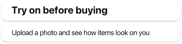
Welcome Screen
WelcomeScreenFeature {
  images {
    welcomeBackground: Image // (1)!
  }

  icons {
    welcome82: Icon // (2)!
  }

  strings {
    welcomeTitle: String // (3)!
    welcomeDescription: String // (4)!
    welcomeButtonStart: String // (5)!
  }

  typography {
    welcomeTitle: TextStyle // (6)!
    welcomeDescription: TextStyle // (7)!
  }
}
- Sets the background image that covers the entire welcome screen.
- Defines the main icon displayed in the center of the welcome screen above the title.
- Specifies the main title text displayed on the welcome screen.
- Configures the descriptive text that appears below the title on the welcome screen.
- Sets the text label for the button that initiates the onboarding process or main interface.
- Controls the text style for the welcome screen's main title.
- Defines the text style for the welcome screen's description text.
Onboarding
OnboardingFeature {
  howItWorksPage: OnboardingHowItWorksPageFeature // (1)!
  bestResultsPage: OnboardingBestResultsPageFeature | null // (2)!

  strings {
    onboardingButtonNext: String // (3)!
    onboardingButtonStart: String // (4)!
  }

  shapes {
    onboardingImageL: Shape // (5)!
    onboardingImageS: Shape // (6)!
  }

  dataProvider: BuiltIn | Custom {
    isOnboardingCompleted: Observable<Bool> // (7)!
    completeOnboarding: Callback() // (8)!
  }
}
- Configures the first page of onboarding that demonstrates how virtual try-on works through interactive examples.
- Sets up an optional page showing examples of photos that yield the best try-on results.
- Defines the text label for the navigation button to proceed to the next onboarding page.
- Specifies the text label for the button that completes onboarding and starts the main interface.
- Controls the shape configuration for large images displayed in the onboarding process.
- Sets the shape configuration for small images used in the onboarding interface.
- Provides an observable property that tracks whether the user has completed the onboarding process.
- Defines the callback function to mark onboarding as completed when the user finishes the process.
How It Works
OnboardingHowItWorksPageFeature {
  images {
    onboardingHowItWorksItems: List<{ // (6)!
      itemPhoto: Image // (1)!
      itemPreview: Image // (2)!
    }>
  }

  strings {
    onboardingHowItWorksPageTitle: String | null // (3)!
    onboardingHowItWorksTitle: String // (4)!
    onboardingHowItWorksDescription: String // (5)!
  }
}
- Defines the example photo showing a person wearing the item for the try-on demonstration.
- Specifies the flatlay image of the item with a transparent background for the try-on preview.
- Sets an optional title for the "How It Works" page at the top of the screen.
- Defines the main title displayed below the interactive try-on demonstration section.
- Configures the descriptive text explaining how the virtual try-on feature works.
- List of exactly 3 objects, each containing images for the interactive onboarding.
Best Results
OnboardingBestResultsPageFeature {
  images {
    onboardingBestResultsGood: List<Image> // (1)!
    onboardingBestResultsBad: List<Image> // (2)!
  }

  icons {
    onboardingBestResultsGood24: Icon // (3)!
    onboardingBestResultsBad24: Icon // (4)!
  }

  strings {
    onboardingBestResultsPageTitle: String | null // (5)!
    onboardingBestResultsTitle: String // (6)!
    onboardingBestResultsDescription: String // (7)!
  }

  styles {
    reduceOnboardingBestResultsShadows: Bool // (8)!
  }
}
- List of exactly 2 example photos that demonstrate optimal conditions for virtual try-on results.
- List of exactly 2 of example photos showing conditions that may lead to suboptimal try-on results.
- Icon displayed next to good example photos to indicate positive results.
- Icon displayed next to bad example photos to indicate potential issues.
- Optional title for the "Best Results" page at the top of the screen.
- Main title displayed above the example photos section.
- Descriptive text explaining what makes a good photo for virtual try-on.
- Controls whether to reduce shadow effects on example photos for better visibility.
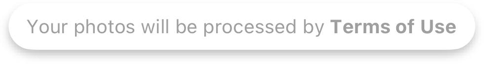
Consent
ConsentEmbeddedIntoOnboardingFeature {
  strings {
    consentHtml: String // (1)!
  }
}
- HTML content displayed at the bottom of the onboarding screen for embedded consent.
ConsentStandaloneOnboardingPageFeature {
  strings {
    consentPageTitle: String | null // (1)!
    consentTitle: String // (2)!
    consentDescriptionHtml: String // (3)!
    consentFooterHtml: String | null // (4)!
    consentButtonAccept: String // (5)!
  }

  icons {
    consentTitle24: Icon // (6)!
  }

  styles {
    drawBordersAroundConsents: Bool // (7)!
  }

  data {
    consents: List<Consent> // (8)!
  }

  dataProvider: BuiltIn | Custom {
    obtainedConsentIds: Observable<List<string>> // (9)!
    obtainConsentIds: Callback(List<string>) // (10)!
  }
}
- Optional title for the standalone consent page at the top of the screen.
- Main title displayed on the standalone consent page.
- HTML content describing the consent terms and conditions.
- Optional HTML footer content for additional information.
- Text label for the button that accepts the consent terms.
- Icon displayed next to the consent title in the standalone page.
- Controls whether to display borders around consent sections.
-
List of consent options that users must and may accept.
See consent scheme for more deatils
-
Observable property tracking which consent options have been already accepted.
-
Callback function triggered when user accepts consents.
You should save the consent IDs that are passed and provide them in the
obtainedConsentsIdsproperty for future use. If not stored, the SDK will show the consent screen again during the next Try-On session.
ConsentStandaloneImagePickerPageFeature {
  strings {
    consentPageTitle: String | null // (1)!
    consentTitle: String // (2)!
    consentDescriptionHtml: String // (3)!
    consentFooterHtml: String | null // (4)!
    consentButtonAccept: String // (5)!
  }

  icons {
    consentTitle24: Icon // (6)!
  }

  styles {
    drawBordersAroundConsents: Bool // (7)!
  }

  data {
    consents: List<Consent> // (8)!
  }

  dataProvider: BuiltIn | Custom {
    obtainedConsentsIds: Observable<List<string>> // (9)!
    obtainConsentsIds: Callback(List<string>) // (10)!
  }
}
- Optional title for the standalone consent page at the top of the screen.
- Main title displayed on the standalone consent page.
- HTML content describing the consent terms and conditions.
- Optional HTML footer content for additional information.
- Text label for the button that accepts the consent terms.
- Icon displayed next to the consent title in the standalone page.
- Controls whether to display borders around consent sections.
-
List of consent options that users must and may accept.
See consent scheme for more deatils
-
Observable property tracking which consent options have been already accepted.
-
Callback function triggered when user accepts consents.
You should save the consent IDs that are passed and provide them in the
obtainedConsentsIdsproperty for future use. If not stored, the SDK will show the consent screen again during the next Try-On session.
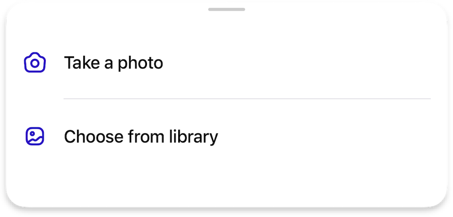
Image Picker
ImagePickerFeature {
  camera: ImagePickerCameraFeature | null // (1)!
  photoGallery: ImagePickerPhotoGalleryFeature // (2)!
  predefinedModels: ImagePickerPredefinedModelFeature | null // (3)!
  uploadsHistory: ImagePickerUploadsHistoryFeature | null // (4)!

  images {
    examples: List<Image> // (5)!
  }

  strings {
    imagePickerTitleEmpty: String // (6)!
    imagePickerDescriptionEmpty: String // (7)!
    imagePickerButtonUploadImage: String // (8)!
  }
}
- Configuration for camera functionality, allowing users to take new photos directly within the SDK.
- Configuration for accessing and selecting images from the device's photo library.
- Configuration for using predefined model images as an alternative to user photos.
- Configuration for managing and reusing previously uploaded images.
- List of exactly 2 example of input images to display in the image picker interface.
- Title text displayed above images when the image picker is empty.
- Description text shown when the image picker is empty.
- Label text for the button used to upload new photos.
Camera
ImagePickerCameraFeature {
  icons {
    camera24: Icon // (1)!
  }

  strings {
    cameraButtonTakePhoto: String // (2)!
    cameraPermissionTitle: String // (3)!
    cameraPermissionDescription: String // (4)!
    cameraPermissionButtonOpenSettings: String // (5)!
  }
}
- Icon displayed for the camera button in the bottom sheet list.
- Label text for the button used to take a photo.
- Title text displayed in the alert when camera permissions are denied.
- Description text shown in the alert when camera permissions are denied.
- Label text for the button that opens app settings to change camera permissions.
Photo Gallery
ImagePickerPhotoGalleryFeature {
  icons {
    gallery24: Icon // (1)!
  }

  strings {
    galleryButtonSelectPhoto: String // (2)!
  }
}
- Icon displayed for the gallery button in the bottom sheet list.
- Label text for the button used to select a photo from the gallery.
Predefined Models
ImagePickerPredefinedModelFeature {
  icons {
    selectModels24: Icon // (1)!
  }

  data {
    preferredCategoryId: String // (2)!
  }

  strings {
    predefinedModelPageTitle: String // (3)!
    predefinedModelOr: String // (4)!
    predefinedModelErrorEmptyModelsList: String // (5)!
    predefinedModelCategories: Map<String, String> // (6)!
  }
}
- Icon displayed for the predefined models button in the bottom sheet list.
- Identifier of the preferred category to show by default when user opens models page.
- Title text for the predefined models page and button in the bottom sheet list.
- Label text displayed before the predefined models button in the image picker.
- Error message shown when the list of predefined models is empty.
- Mapping of category identifiers to their display titles, typically covering
manandwomancategories.
Uploads History
ImagePickerUploadsHistoryFeature {
  strings {
    uploadsHistoryButtonNewPhoto: String // (1)!
    uploadsHistoryTitle: String // (2)!
    uploadsHistoryButtonChangePhoto: String // (3)!
  }

  styles {
    changePhotoButtonStyle: primary | blurred // (4)!
  }

  dataProvider: BuiltIn | Custom {
    uploadedImages: Observable<List<InputImage>> // (5)!
    addUploadedImagesAction: Callback(List<InputImage>) // (6)!
    deleteUploadedImagesAction: Callback(List<InputImage>) // (7)!
    selectUploadedImageAction: Callback(InputImage) // (8)!
  }
}
- Text label for the button to upload a new photo.
- Title text displayed at the top of the uploads history bottom sheet.
- Text label for the button to change the currently selected photo.
- Visual style for the change photo button, either primary (solid) or blurred (with optional outline).
- Observable collection of images previously uploaded by the user, with most recent first.
- Callback to add new images to the uploads history.
- Callback to remove images from the uploads history.
- Callback to move a selected image to the top of the history when reused.
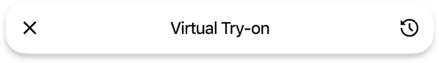
Try On
TryOnFeature {
  tryOn {
    loadingPage: TryOnLoadingPageFeature // (1)!
    inputImageValidation: TryOnInputImageValidationFeature // (2)!
    cart: TryOnCartFeature // (3)!
    fitDisclaimer: TryOnFitDisclaimerFeature | null // (4)!
    feedback: TryOnFeedbackFeature | null // (5)!
    generationsHistory: TryOnGenerationsHistoryFeature | null // (6)!
    otherPhoto: TryOnWithOtherPhotoFeature | null // (7)!

    settings {
      isBackgroundExecutionAllowed: Bool // (8)!
      tryGeneratePersonSegmentation: Bool // (9)!
    }

    icons {
      tryOn20: Icon // (10)!
    }

    strings {
      tryOnPageTitle: String // (11)!
      tryOn: String // (12)!
    }

    styles {
      tryOnButtonGradient: List<Color> | null // (13)!
    }
  }
}
- Configuration for the loading page displayed during the TryOn process.
- Configuration for validating input images before processing.
- Configuration for cart-related functionality in the TryOn interface.
- Optional configuration for displaying fit disclaimers to users.
- Optional configuration for collecting user feedback on TryOn results.
- Optional configuration for managing the history of generated TryOn results.
- Optional configuration for allowing users to continue with a different photo.
- Determines whether the SDK should wait for the generation results in the background when closed.
- Enables local person segmentation highlighting during loading on iOS 15+.
- Icon displayed for the TryOn magic button in the interface.
- Title text displayed at the top of the TryOn page.
- Label text used for the "Try On" buttons throughout the interface.
- Optional gradient colors for styling the TryOn button.
Loading Page
TryOnLoadingPageFeature {
  strings {
    tryOnLoadingStatusUploadingImage: String // (1)!
    tryOnLoadingStatusScanningBody: String // (2)!
    tryOnLoadingStatusGeneratingOutfit: String // (3)!
  }

  styles {
    loadingStatusBackgroundGradient: List<Color> | null // (4)!
    loadingStatusStyle: primary | blurred | blurredWithOutline // (5)!
  }
}
- Text displayed while uploading the user's image to the server.
- Text displayed while scanning and analyzing the body in the image.
- Text displayed while generating the virtual try-on outfit.
- Optional gradient colors for the loading status background.
- Visual style for the loading status indicator, either primary (solid) or blurred (with optional outline).
Input Image Validation
TryOnInputImageValidationFeature {
  strings {
    invalidInputImageDescription: String // (1)!
    invalidInputImageChangePhotoButton: String // (2)!
  }
}
- Message displayed to users when their uploaded image fails validation.
- Label text for the button that allows users to select a different photo.
Cart
TryOnCartFeature {
  strings {
    addToCart: String // (1)!
  }

  handler {
    addToCartAction: Callback(String) // (2)!
  }
}
- Label text for the button that adds the current product to the cart.
- Callback function that handles adding a product to the cart using its identifier.
Fit Disclaimer
TryOnFitDisclaimerFeature {
  icons {
    info20: Icon | null // (1)!
  }

  strings {
    fitDisclaimerTitle: String // (2)!
    fitDisclaimerDescription: String // (3)!
    fitDisclaimerButtonClose: String // (4)!
  }
}
- Optional icon displayed in the fit disclaimer to provide visual context.
- Title text displayed in the fit disclaimer message.
- Detailed description text explaining the fit disclaimer information.
- Label text for the button that dismisses the fit disclaimer.
Feedback
TryOnFeedbackFeature {
  otherFeedback: TryOnFeedbackOtherFeature | null // (1)!

  icons {
    like36: Icon // (2)!
    dislike36: Icon // (3)!
    gratitude40: Icon // (4)!
  }

  strings {
    feedbackOptions: List<String> // (5)!
    feedbackTitle: String // (6)!
    feedbackButtonSkip: String // (7)!
    feedbackButtonSend: String // (8)!
    feedbackGratitudeText: String // (9)!
  }
}
- Optional configuration for allowing users to provide custom feedback on try-on results.
- Icon displayed for the "Like" feedback option.
- Icon displayed for the "Dislike" feedback option.
- Icon shown after feedback is submitted to express gratitude.
- List of available feedback options presented to users.
- Title text displayed in the feedback section.
- Label text for the button that allows users to skip providing feedback.
- Label text for the button that submits the user's feedback.
- Message displayed to users after they submit their feedback.
Other
TryOnFeedbackOtherFeature {
  strings {
    otherFeedbackTitle: String // (1)!
    otherFeedbackButtonSend: String // (2)!
    otherFeedbackButtonCancel: String // (3)!
    otherFeedbackOptionOther: String // (4)!
  }
}
- Title text displayed in the custom feedback section.
- Label text for the button that submits the custom feedback.
- Label text for the button that cancels the custom feedback.
- Text label for the option to provide custom feedback.
Generations History
TryOnGenerationsHistoryFeature {
  icons {
    history24: Icon // (1)!
  }

  strings {
    generationsHistoryPageTitle: String // (2)!
  }

  dataProvider: BuiltIn | Custom {
    generatedImages: Observable<List<GeneratedImage>> // (3)!
    addGeneratedImages: Callback(List<GeneratedImage>) // (4)!
    deleteGeneratedImages: Callback(List<GeneratedImage>) // (5)!
  }
}
- Icon displayed for the History button in the page bar.
- Title text displayed at the top of the generations history page.
- Observable collection of previously generated try-on images.
- Callback function to add new generated images to the history.
- Callback function to remove images from the generations history.
Other Photo
TryOnWithOtherPhotoFeature {
  icons {
    changePhoto24: Icon // (1)!
  }
}
- Icon displayed for the "Change Photo" action, allowing users to continue with a different photo.
Share
ShareFeature {
  watermark: ShareWatermarkFeature | null // (1)!

  icons {
    share24: Icon // (2)!
  }

  strings {
    shareButton: String // (3)!
  }

  dataProvider: null | Custom {
    getShareText: Callback(productIds: List<String>) => String // (4)!
  }
}
- Optional configuration for adding a watermark to shared content.
- Icon displayed for the share button in the interface.
- Label text for the share button in the fullscreen gallery.
- Optional
dataProvidercallback function that generates additional text to be shared along with the image.
Watermark
ShareWatermarkFeature {
  images {
    logo: Image // (1)!
  }
}
- Logo image to be used as a watermark on shared content.
Wishlist
WishlistFeature {
  icons {
    wishlist24: Icon // (1)!
    wishlistFill24: Icon // (2)!
  }

  strings {
    wishlistButtonAdd: String // (3)!
  }

  dataProvider {
    wishlistProductIds: Observable<List<String>> // (4)!
    setProductInWishlist: Callback(productId: String, inWishlist: Bool) // (5)!
  }
}
- Icon displayed for the Wishlist button in its default state.
- Icon displayed for the Wishlist button when the product is in the wishlist.
- Label text for the "Add to Wishlist" button.
- Observable collection of product IDs currently in the wishlist.
- Callback function to add or remove a product from the wishlist.
Analytics
Analytics {
  handler: {
    onAnalyticsEvent: Callback(Event) // (1)!
  }
}
-
Callback function that processes analytics events generated by the SDK, allowing integration with external analytics services or custom event handling.
DebugSettings
DebugSettings {
  isLoggingEnabled: Bool // (1)!
  emptyStringsPolicy: ValidationPolicy // (2)!
  unavailableResourcesPolicy: ValidationPolicy // (3)!
  infoPlistDescriptionsPolicy: ValidationPolicy // (4)!
  listSizePolicy: ValidationPolicy // (5)!
}

enum ValidationPolicy {
  ignore // (6)!
  warning // (7)!
  fatal // (8)!
}
- Controls whether the SDK should log debug information, providing detailed logs to help developers understand its behavior.
- Validation policy for checking whether required strings in the SDK configuration are not empty, preventing runtime issues.
- Validation policy for checking whether required resources are available and properly configured.
- Validation policy for checking whether the
info.plistfile contains all required descriptions for enabled features. - Validation policy for checking whether lists required by the SDK are of the correct size.
- Ignores all validation errors, allowing the SDK to proceed without taking any action.
- Logs validation errors to the console for debugging purposes without interrupting execution.
- Stops the application's execution with a fatal error when validation errors occur.